© ALL RIGHTS RESERVED
Punch it Chewie
Shavilchandra@gmail.com
1
2
SHAV
MISSION LOG. 2043 INCOMING TRANSMISSIONMISSION LOG. 2043 INCOMING TRANSMISSIONMISSION LOG. 2043 INCOMING TRANSMISSIONMISSION LOG. 2043 INCOMING TRANSMISSIONMISSION LOG. 2043 INCOMING TRANSMISSIONMISSION LOG. 2043 INCOMING TRANSMISSION

Project Story
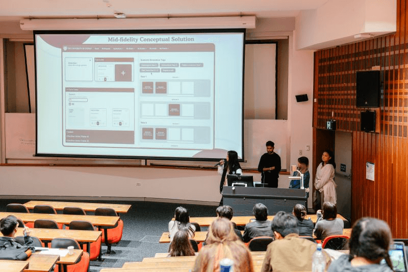
Put together with three fellow student designers, I dove into this thrilling design competition to gain yet another design experience. This case study tells the story of how it all began, the challenges we faced, our method of design pitching, and how we came away with the win.
The case crack fostered a collaborative process where everyone brought their ideas and expertise to the table. Together, we brainstormed, gathered insights, and iterated on innovative solutions to find the best way forward. Finally, the designs are judged by a panel of Deloitte Digital designers, and a winner is announced.


/
Design Brief
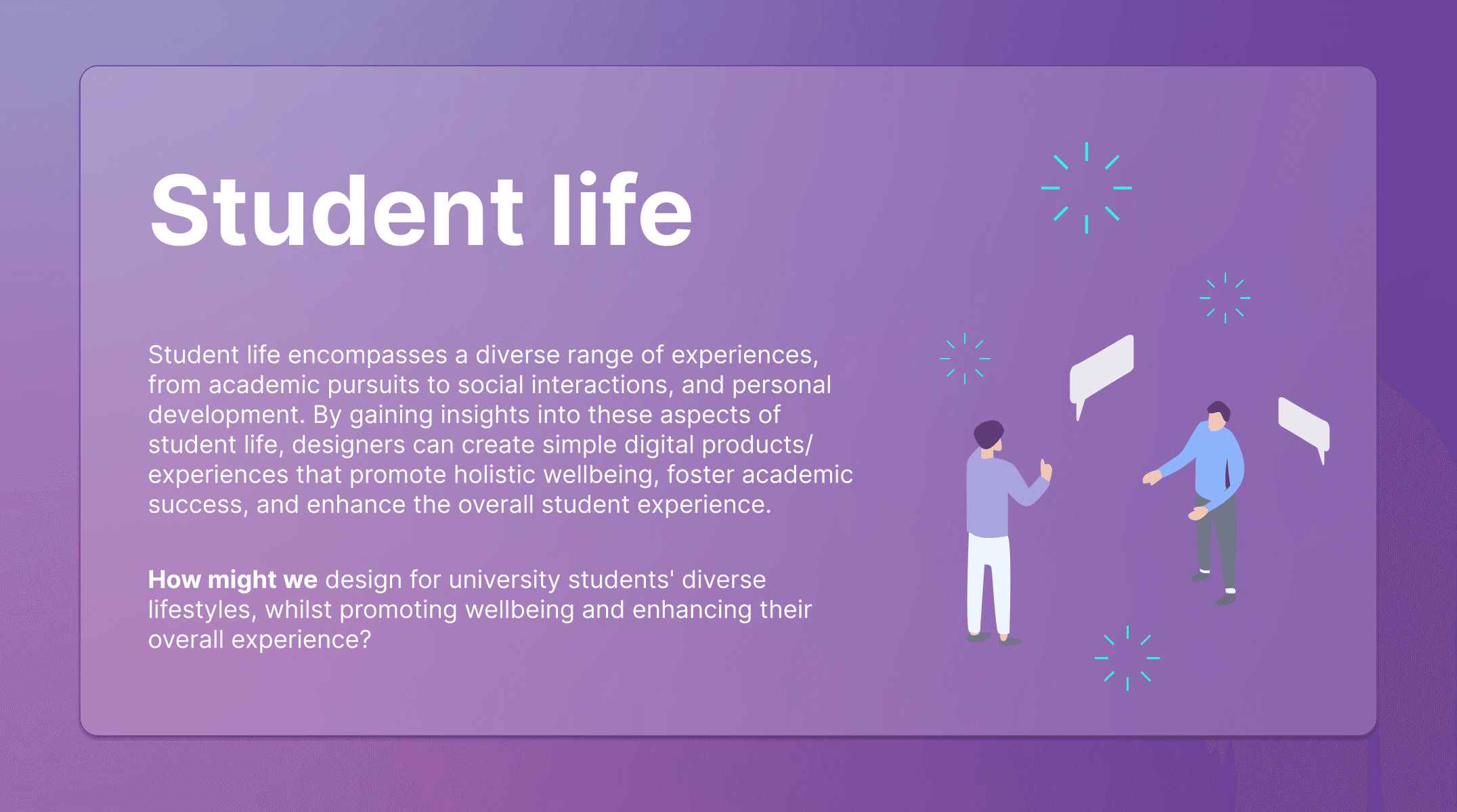
Student life encompasses a diverse range of experiences, from academic pursuits to social interactions and personal development. By gaining insights into these aspects of student life, designers can create simple digital products and experiences that promote holistic wellbeing, foster academic success, and enhance the overall student experience.
By the end of this chapter, a bigger issue had started to show itself. The challenge was no longer just making and maintaining assets. It was that many teams still did not have a clear way to discover, understand, and confidently use the system. That became the cliffhanger leading into the next season.
The beginning
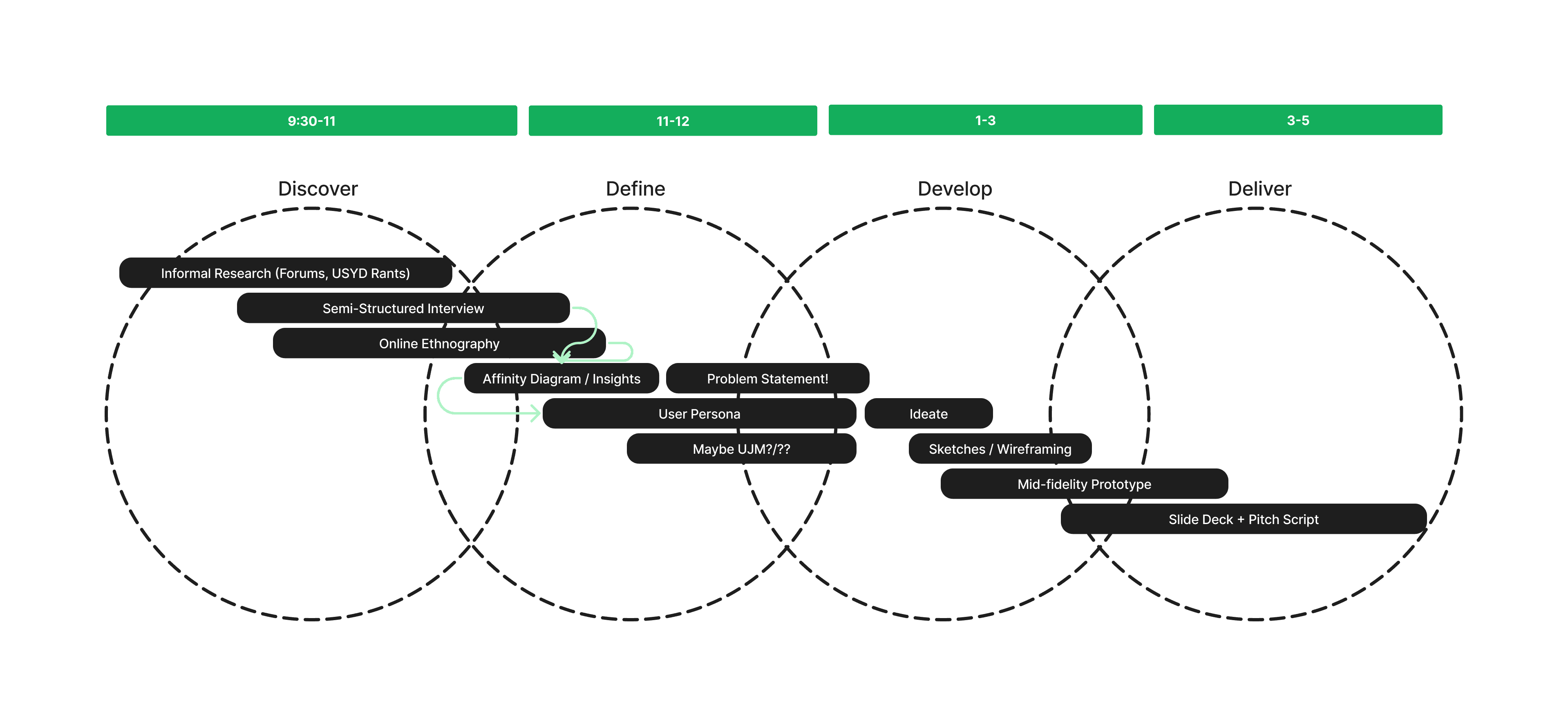
Given the nature of the competition, our need to fulfil user research, and our intention to follow a design process, I divided up our day to loosely align with the Double Diamond structure. As organised as I wanted to be, I also had to remain flexible and facilitate my team’s strengths and motivations. We bent a few AI tools to our will too, helping us land on reasoning and interpretations from our research.
/
UX Research
Research focus
Research Goals
What are students’ expectations for their course of study?
What confusions and barriers do they bump into when making course decisions?
How prepared do students feel about entering university?
Let me paint you a picture

/
What we discovered…
Readability is poor
Not user friendly
We analysed our research data using an affinity diagram. FigJam was our best friend when it came to drawing out common themes from a wide range of quotes and qualitative data points we collected.
A lean user persona was the perfect way to visualise the insights pulled from the affinity diagram, including pain points and user needs.
Confused Chloe was born from this process.

Goal
/
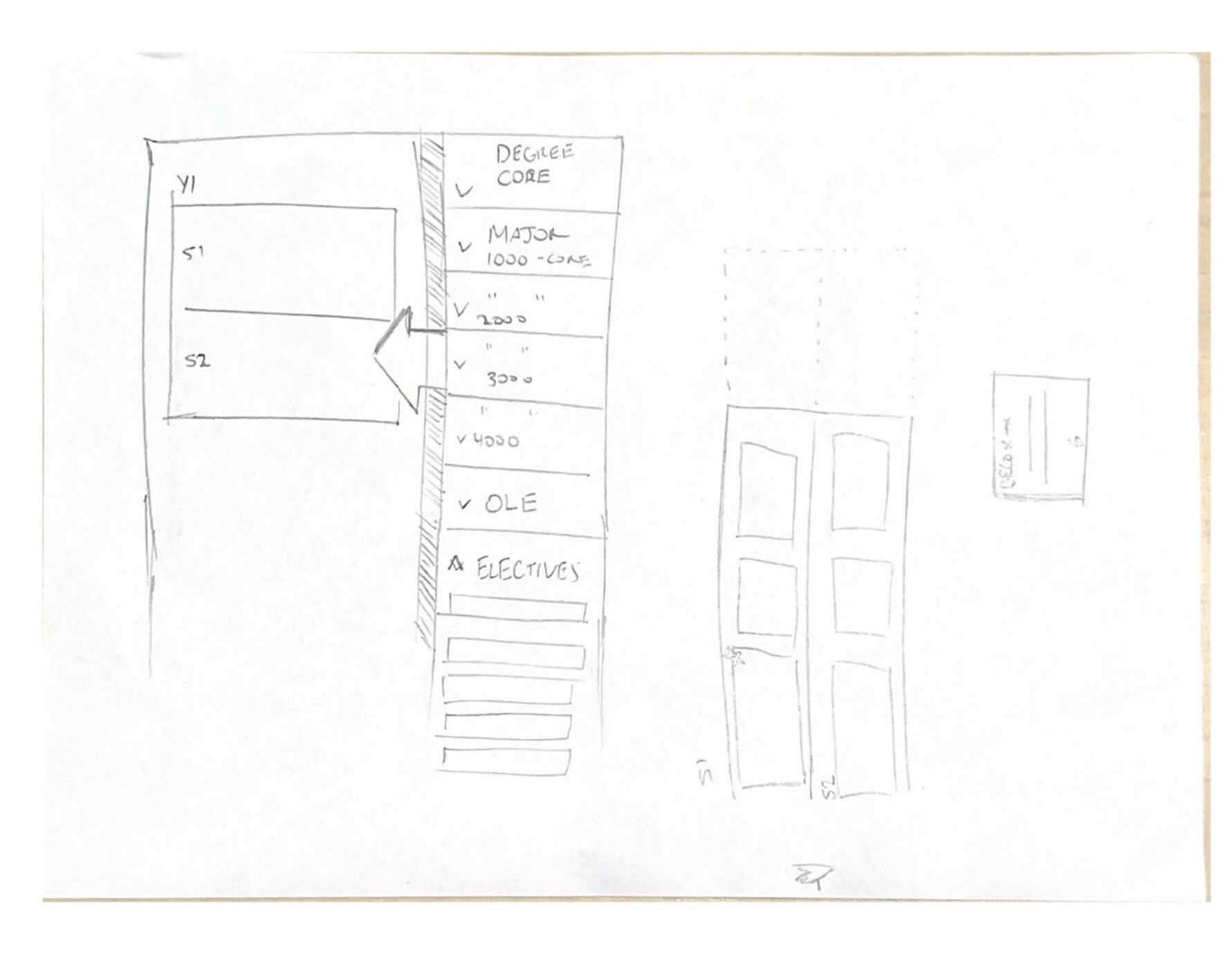
The very lean pitch
Features
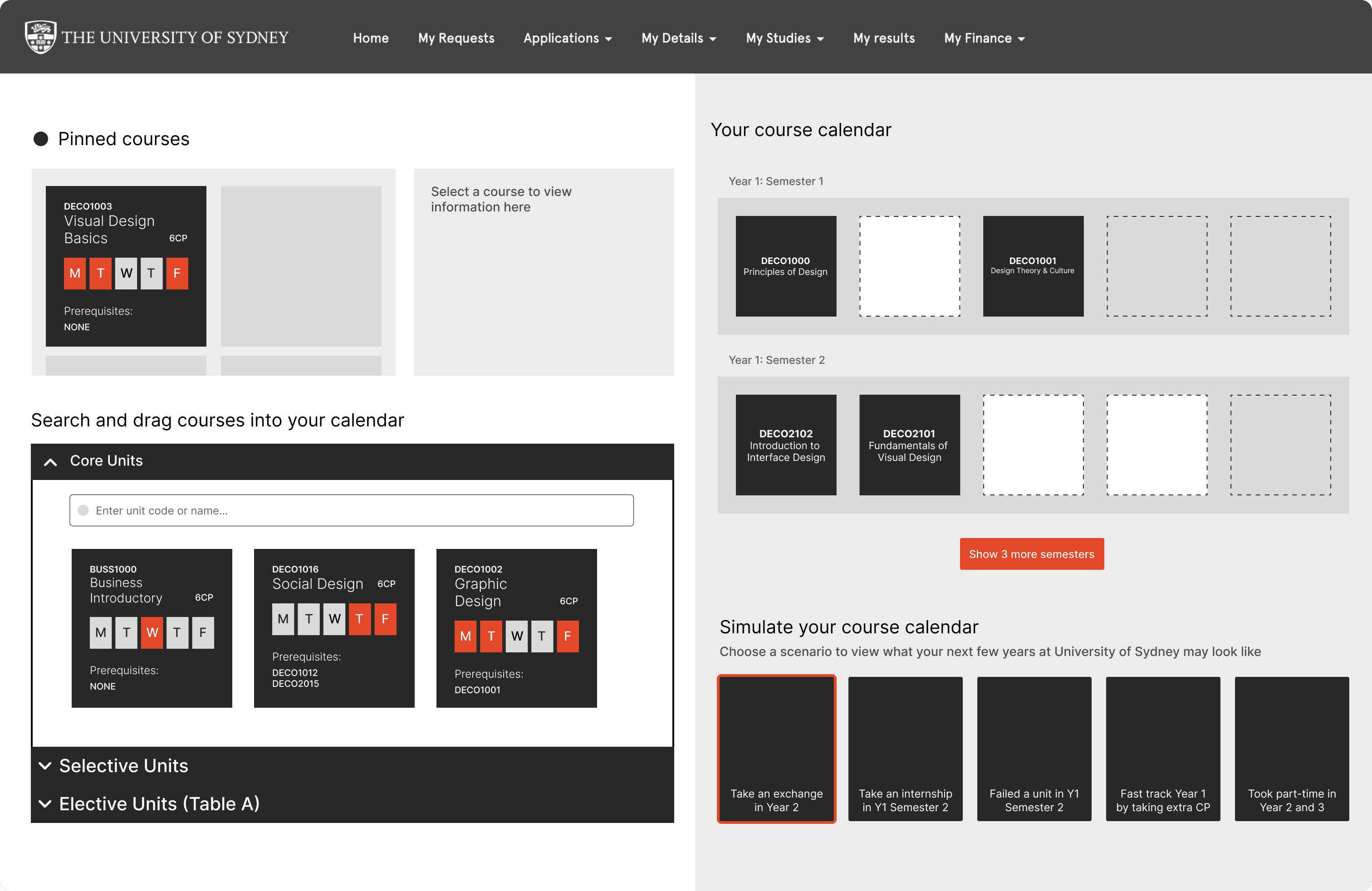
We discovered that students were making their own Excel spreadsheets just to visually digest their study plan. This made the current handbooks and selection table feel ineffective. In response, we designed a grid table where students could snap unit tiles into place.
Our standout innovative feature was the ability for students to select tags based on common scenarios that inevitably affect course structure, such as going on exchange, taking time off for an internship, or repeating a unit.
Once selected, the planner would temporarily adjust the table structure so students could foresee the impact on future years. This would help them make more informed decisions and feel more confident in their academic journey.


This was such a rewarding experience, a break from my assignments. I had made very good friends across my faculty by getting involved in this.
/ Future iterations
Develop a mid-fidelity prototype and conduct usability and conceptual testing
Ensure the solution aligns with university policies and motivations
Explore additional features beyond the MVP, including the ability to set academic advisory meetings
/ Lessons Learned
Not in many cases would you draw so directly from your own personal experience in product design
Presentation skills, and the ability to anticipate Q&A during a pitch, are critical in design pitching
Have fun. Strategy and innovation are often fostered through creativity