© ALL RIGHTS RESERVED
SHAV

01. Overview
Client
Department of Health, Disability & Ageing (DHDA)
/
Duration
2 months
/
Year
2025
/
Role
UI/UX Designer


02. Role
My work sat inside the Enterprise Identity Access Management System, a core system responsible for securing access across government services. It handles authentication at scale, which means every interaction is tied to compliance, risk, and Salesforce platform constraints that can’t be casually redesigned. This was my first lead UI/UX role within an enterprise.

03. THE PROJECT
Brief
The technical team is seeking a UX uplift of the MFA system, focusing on improvements in language, communication, interface design, and boosting user confidence in recovery. This discovery phase was designed to understand why users struggle with MFA setup, recovery, and ongoing management of authentication methods.
Approach
The research aims to uncover trust issues, cognitive load challenges, and points of hesitation, while identifying opportunities to reduce admin intervention and improve overall user confidence. Insights will guide enhancements that make the MFA experience clearer, more intuitive, and resilient in real-world conditions.
Shape strategic direction: Start by understanding people and the problem space, using real insights to define what we’re solving and where the product should go.
Build the Case: Turn those insights into a clear direction, aligning user needs with business goals and defining what success looks like.
Design & Test: Design solutions and test them with users early, making sure they actually work and feel right before moving forward.
Test & Deliver Solutions: Refine and ship solutions through continuous testing, ensuring they are usable, accessible, and hold up in real scenarios.
Measure Impact & Improve: Track how the solution performs after release, using data and feedback to iterate and improve over time.
04. PROCESS
Research Objectives
Solution
Usability Testing - Sprint 1

05. Design Discovery
Discovery Sprint 1
In this sprint, I took a deep dive into the current MFA experience, reframing four system flows into three core user tasks based on how users actually move through authentication.
User flows for testing
Registration flow
Primary user goal:
Set up MFA device for secure access
System Trigger:
No recognised registered account, first time login
flow branches:
Authentication application, windows hello or security key, passkey
Login flow
Primary user goal:
Authenticate and access portal
System Trigger:
Successful registration, User
flow branches:
Authentication application, windows hello or security key, passkey, Reset device, New device. Soft lock.
Reset device flow
Primary user goal:
Remove a lost device OR reset MFA account
System Trigger:
User-initiated after soft lock, or via device management
flow branches:
Removal of registered methods including OATH, Windows hello, passkey. Hard lock.
New device flow
Primary user goal:
Add backup secondary MFA
System Trigger:
User initiated
flow branches:
Step up authentication - then adding Authentication application, windows hello or security key, passkey
Usability Testing
Date: Nov 24 - Dec 10
Method: Remote, think-aloud scenarios
Participants: 10
User tasks

Registration MFA task

Adding secondary device task

Log in task (sad path)
06. FINDINGS

In this sprint, I used affinity mapping of all quotes from the 10 interviews to find about 12 themes which I condensed into 6 key findings which I’ll base my recommendations off.
Insight 1
The wording is all over the place, so users are guessing what each button actually does and misinterpreting flows and information.
Violated usability heuristics:
Consistency and Standards
Match between system and real word expectations
View evidence
Inconsistent terminology (e.g recover vs reset vs remove, device vs method), varied naming of authenticator (OATH vs TOTP vs Auth App) and technical UI copy misleads and confuses users about what actions they are performing
Insight 2
No feedback means no user confidence. Users are guessing their through steps because the system rarely reacts.
Violated usability heuristics:
Visibility of system status
Recognition rather than recall
View evidence
Users need feedback to reinforce actions and lower cognitive barrier. The lack of clear progress, and timely success indicators leaves users unsure whether key actions have worked, increasing cognitive effort required to complete basic steps. Users are lost in the progress of registering, logging in, adding device and resetting MFA methods
Insight 3
Once errors start, morale tanks fast. Instructions are unclear, steps feel like dead ends and users feel blamed.
Violated usability heuristics:
Help users recognise, diagnose and recover from errors
Error prevention
View evidence
Soft lock message unclear and confuses users about what’s happening and what’s the best course of action, triggering method removal without knowing the risk of hard lock. Error message for invalid OTP code not clear if it was a system error or user error The hard lock creates a dead-end feeling by not clearly showing options, and most users miss the Transaction ID
Insight 4
Recovery codes evaporate from user's minds. They save them in nuanced spots or don't bother at all because they don't understand it's importance
Violated usability heuristics:
Recognition rather than recall
Match between system and real word expectations
View evidence
Users struggle to manage recovery codes because storing and recalling long alphanumeric combinations is unnatural and high effort Print button was almost never used, one user noting that a hard copy is harder to track down When reseting device, 2 users did not recall what recovery codes were, and only 4 users read the recovery code description after completing a MFA method registration
Insight 5
Users take the path of least resistance, if a flow doesn't give them enough control or emphasis on why something matters, they'll skip it.
Violated usability heuristics:
User control and freedom
Help and documentation
View evidence
Users hesitate when they aren't aware of the level of control security may have when using personal devices User’s ignore optional MFA actions like adding a secondary method, unless they are compelled to. Users hesitate when asked to use personal devices without understanding what IT can access or control. This could be a comprehension and learning opportunity. When hard lock arises, users feel restricted and unclear on how effective contacting support would be. Majority users indicated they would try calling someone because it’s faster. Escape hatches are rare, no back buttons when completing flows
Insight 6
There are a handful of user interface design kinks
Violated usability heuristics:
Consistency and Standards
Aesthetics and minimal design
View evidence
Spacing and typography inconsistencies Capitalisation and hyphenation inconsistent Role of colour when denoting hyperlinks, destructive states and primary actions can be refined Pattern inconsistency: Drop down pattern being used for selection can be improved to increase visibility of MFA methods. Error patterns, and
Language and Clarity
Feedback and system response


In this sprint, we set out to generate innovative ideas
that deliver exceptional customer experiences and
uncover new business opportunities, all without
letting technical limitations hold us back.
UX Outcomes
UX Psychology Toolkit
Design Principles
Content Framework
Extended Design Exploration: Your Monthly Wrap-Up

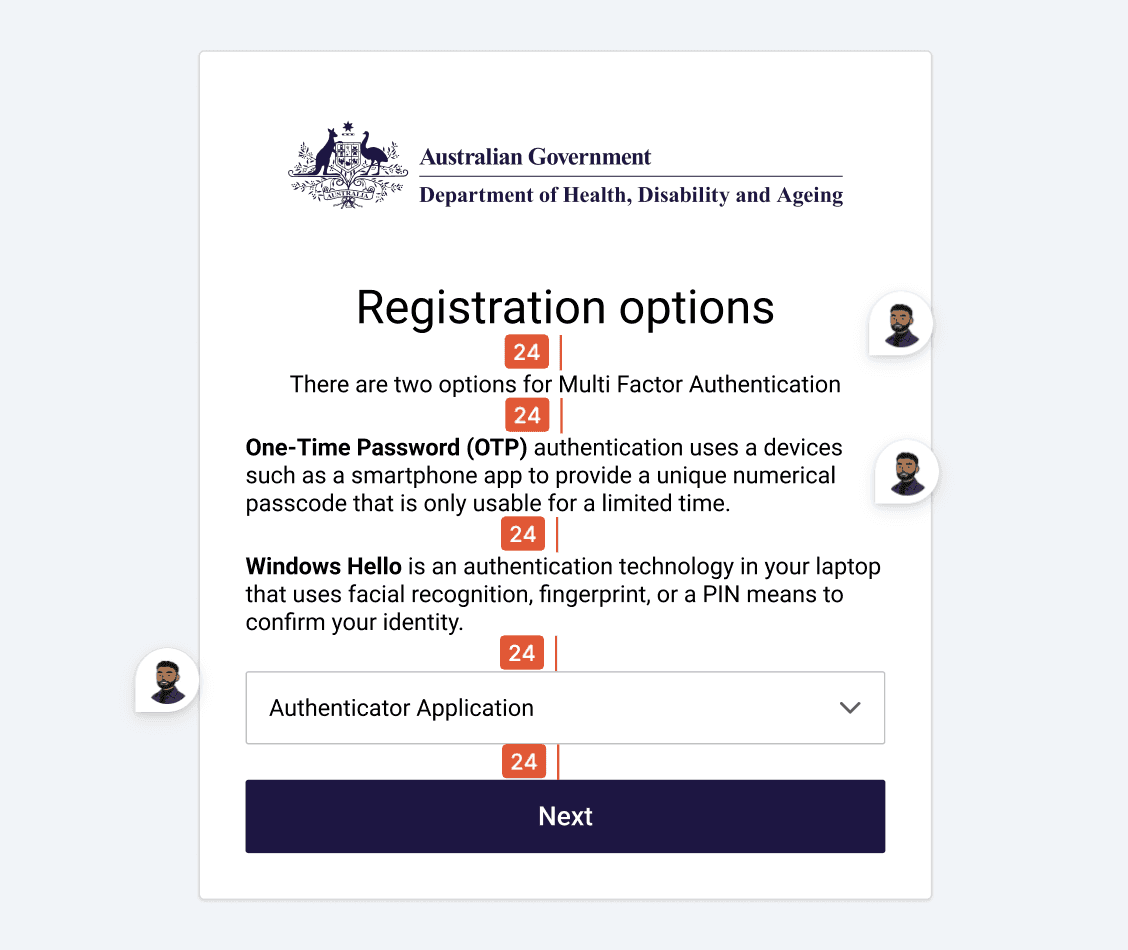
MFA set up
The MFA set-up was redesigned to reduce hesitation from the first interaction, shifting from technical labels to clear, recognisable choices that users can understand instantly. Each method is supported with familiar icons and plain language, allowing users to compare options quickly and select what feels right without second-guessing.
Design Rationale
Use clear icons alongside each method for faster recognition and recall
Apply warm, plain language tone to lower anxiety during initial setup
Use secondary buttons to signal methods are not yet set up
Present all setup options consistently to support comparison and informed choice with secure labels
UX Psychology Applied
Cognitive Ease
Lowering cognitive load through simplified language and consistent patterns reduces hesitation and decision fatigue. This makes users less likely to skip or avoid secure methods, leading to stronger adoption of recommended authentication practices.

Enable back up
The recovery code step was redesigned to guide users through backup setup with clarity and confidence, positioning it as a supportive safeguard rather than an optional extra. By framing this moment as “almost ready,” the flow builds momentum at the final step and reduces the likelihood of drop-off, helping users feel close to completion rather than introducing friction.
Design Rationale
Use reassuring and friendly language to frame backup setup as supportive rather than mandatory
Introduce a checklist pattern to clearly communicate progress and reduce uncertainty
Show the final step as “almost ready” to increase perceived momentum and reduce drop-off
Gate the primary completion action until required steps are acknowledged, reinforcing safe behaviour
UX Psychology Applied
Perceived Progress + Completion Bias:
Framing the step as “almost ready” and using a checklist creates a sense of momentum, encouraging users to complete setup rather than abandon at the final stage.

Final attempt and soft lock
This moment was redesigned to handle failure with clarity and composure, turning a typically frustrating lockout into a controlled, understandable pause. Before users hit a soft lock, a clear “final attempt” message is surfaced inline, setting expectations early and giving users a chance to act more carefully rather than being caught off guard.
Design Rationale
Surface a clear “final attempt” message inline to set expectations before a temporary soft lock
Demote high-risk actions such as resetting methods, with secondary actions and supporting information
Frame the soft lock as a short security pause using warm, human language to reduce frustration and blame
Offer clear escape hatches and recovery options, including trying another method or setting a reminder
UX Psychology Applied
Expectation Setting + Loss Aversion::
Making the final attempt visible prepares users for potential lockout, reducing shock and encouraging more careful behaviour.
Control & Emotional Regulation:
Framing the lock as a temporary pause with clear next steps reduces anxiety, helping users stay composed and make better recovery decisions.

Error and Success Feedback
Error and success states were redesigned to feel clear, consistent, and supportive, removing ambiguity at moments where users are most vulnerable to confusion. Errors are now surfaced inline, directly beneath the input, making it immediately obvious what went wrong without forcing users to search for feedback.
Design Rationale
Place error messages inline, directly beneath the input for immediate visibility
Use calm, human language in error messages and headings to avoid blame and provide clear instruction
Use supportive iconography to visually signal blockers while maintaining trust
Provide a clear recovery path with a back action or alternative method
UX Psychology Applied
Error Recovery & Cognitive Clarity:
Inline feedback reduces search and confusion, helping users quickly understand and correct mistakes without breaking flow.
New Project Potential Unlocked
This work opened up a series of opportunities beyond the initial MFA uplift, demonstrating how targeted UX improvements can scale across systems and teams.
Design System Integration
The outcomes created a strong foundation for integrating the Aged Care Design System, aligning patterns, language, and components across the experience to drive consistency and long-term maintainability. This task could take up to 3 months ensuring platform and product compliance.
Further Testing & Iteration
A second round of user testing was unlocked to validate improvements, refine UX copy, and iterate on flows with greater confidence, ensuring the system continues to improve based on real user behaviour.
Bolstering HCD Capability
The work showcased what a designer operating within HCD can deliver, shifting perception from interface design to system-level thinking. It highlighted the value of research-led design in shaping compliance-driven products and influencing how the wider department approaches digital experiences.
Winning Moments
Running a focused discovery sprint combining usability testing and heuristic evaluation allowed me to quickly uncover real behavioural patterns and translate them into actionable design decisions.
Working within a tightly constrained environment sharpened my ability to design solutions that respect technical and policy limitations while still improving the experience meaningfully.
This project highlighted that in security contexts, clarity is trust. Every decision, from copy to feedback states, directly influenced whether users felt confident or uncertain.
Lessons Learned
Inconsistencies in language and patterns compound across flows, so solving them requires system-level thinking rather than isolated fixes.
The most important moments in MFA are when things go wrong. Investing in error, recovery, and lock states has the biggest impact on user trust.
Everyone dislikes extra steps