© ALL RIGHTS RESERVED
SHAV
REDESIGNING PRODUCT FOR A SAAS
Client
Truffle
/
Duration
6 months
/
Year
2023
/
Role
UI/UX Designer
/
Services
UX research, UI Design, Presentations
OVERVIEW
Sydney foodies at the centre
I focused on making it effortless for users to capture and revisit restaurants. The goal was to reduce friction in how people save, organise, and return to dining experiences without overthinking it.
Experience transformation
Working across research and design, I helped reshape Truffle’s core experience and introducing a clearer structure with features that actually support how people discover and remember places.
●
●
●
SOLUTION? (DANIEL AND NGHI THIS ONES FOR YOU)
●
●
●
HIGHLIGHTS
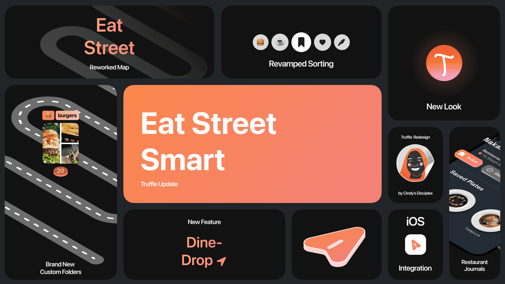
GEO TAGGING RESTAURANTS WITH ‘DINE DROP’
THEMED FOLDER SYSTEM - EAT STREET

PROBLEM
No clear way to narrow: Users struggled to filter by what actually matters—vibe, location, or dietary needs. Discovery felt broad and overwhelming rather than intentional.
Saving without returning: Restaurants were saved with good intent, but rarely revisited. Over time, lists became long, unstructured, and easy to ignore.
Tools that don’t fit behaviour: Existing tools like Instagram and Notes offered flexibility, but lacked structure. Users were forced to create their own systems, which made recall unreliable.
OUR GOAL
The prodigi way
APPROACH
Unpacking behaviours, defining breakdowns, and mapping the journey to insight.
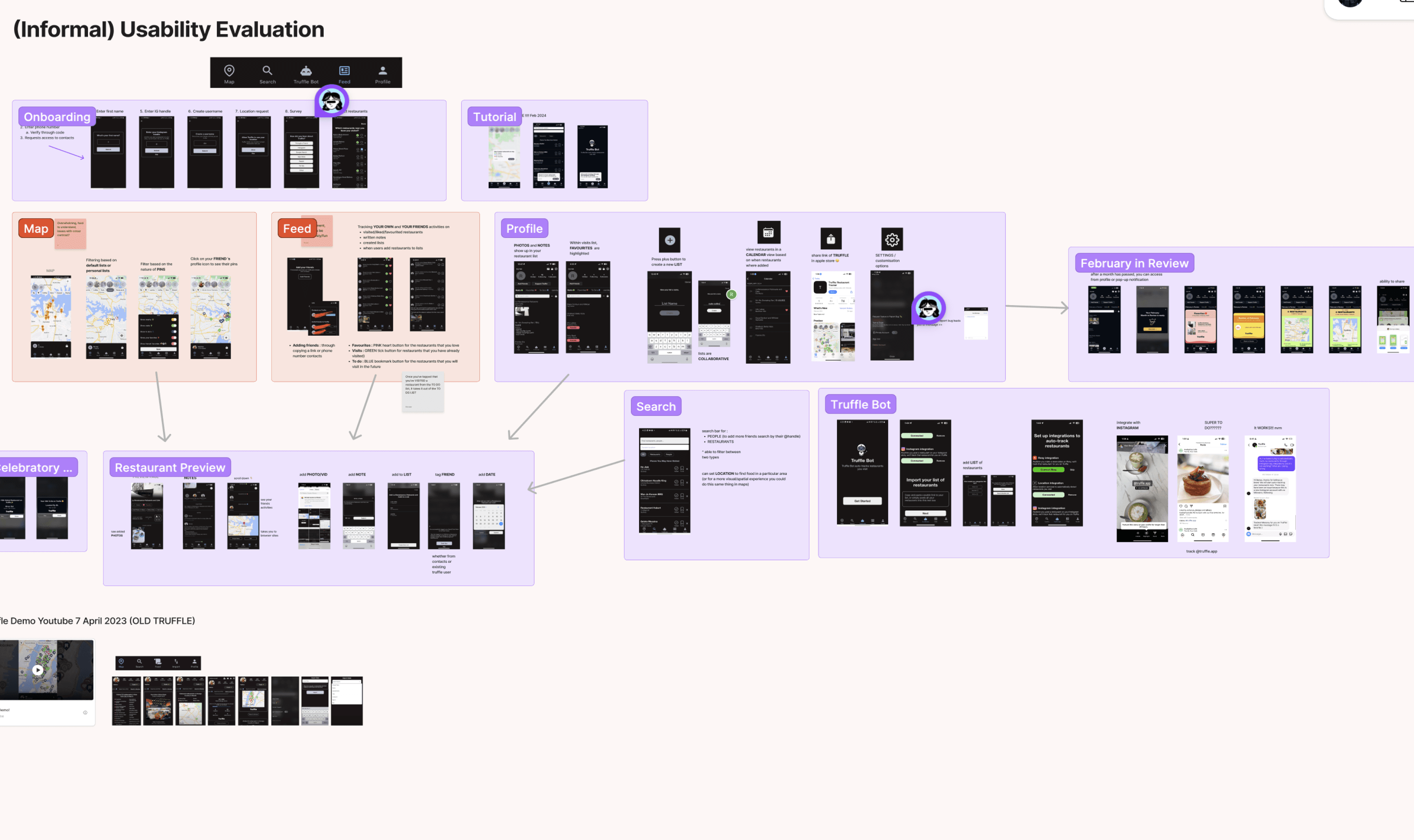
We began in the empathy phase by unpacking the brief and forming research questions around behaviours, motivations, and the intersection of food and social media. From there, we immersed ourselves in Truffle through usability evaluation, desktop research, and competitor analysis to understand its target users—variety-seeking individuals driven by exploration and self-expression

We translated our insights into personas to ground the problem in real behaviours. Diana represents a variety-seeker, someone constantly discovering new places, but struggling to keep track of them in a way that’s actually useful later. Through stakeholder workshops, we mapped and prioritised the core user goals that shape this experience, aligning them with what the product needs to deliver.
Through this, it became clear there was a heavy emphasis on getting the simple things right.
USER JOURNEY
We broke the experience down into stages to see where things actually start to fall apart. What begins as excitement quickly turns into hesitation, as Diana struggles to narrow options and make sense of what she’s seeing. The lack of visual depth and clear prioritisation creates friction, turning what should be a quick decision into a drawn-out process.
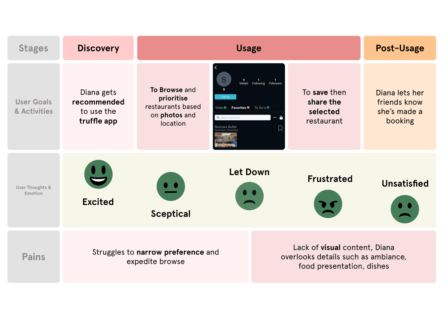
Alongside stakeholder concerns, we grounded the problem in real user behaviour—looking at how people discover, save, and return to restaurants across platforms.
The current experience wasn’t broken, but it fell short where it mattered. Recall was unreliable, information lacked structure, and navigation made simple tasks feel harder than they should be.
Recall breaks under volume
Users save everywhere—screenshots, Notes, private folders—but when it matters, they can’t find what they’re looking for. The restaurant is buried somewhere in the list.
Discovery lacks structure
Exploration is rich but messy. Social platforms prioritise randomness over relevance, forcing users to rely on memory instead of meaningful filtering.
Information lacks trust
Dietary needs, location context, and accuracy aren’t reliable. Users default to safe, repeated choices instead of exploring something new.
To finish off our discovery, we translated these findings into four key insights
Recall via Recording
Users are already recording everywhere screenshots, Notes, private folders but recall breaks under volume and timing.

Camera eats first
Choice is driven by visuals, vibe, colours, portions, ambience but current platforms scatter this across feeds.

Opinions → Recommendations
Users already rate, caption, and share food experiences with close circles, but that signal gets lost.

Exploration is key
Users want to filter by location, dietary suitability, and trusted recommendations. Social platforms lack precise filters, while maps lack social and visual richness, making it harder to explore with confidence.
Chaos ensued when we spent 3 nights affinity diagram into 1 singular polished problem statement which we had to present back to the Prodigi judges during our Mid session showcase
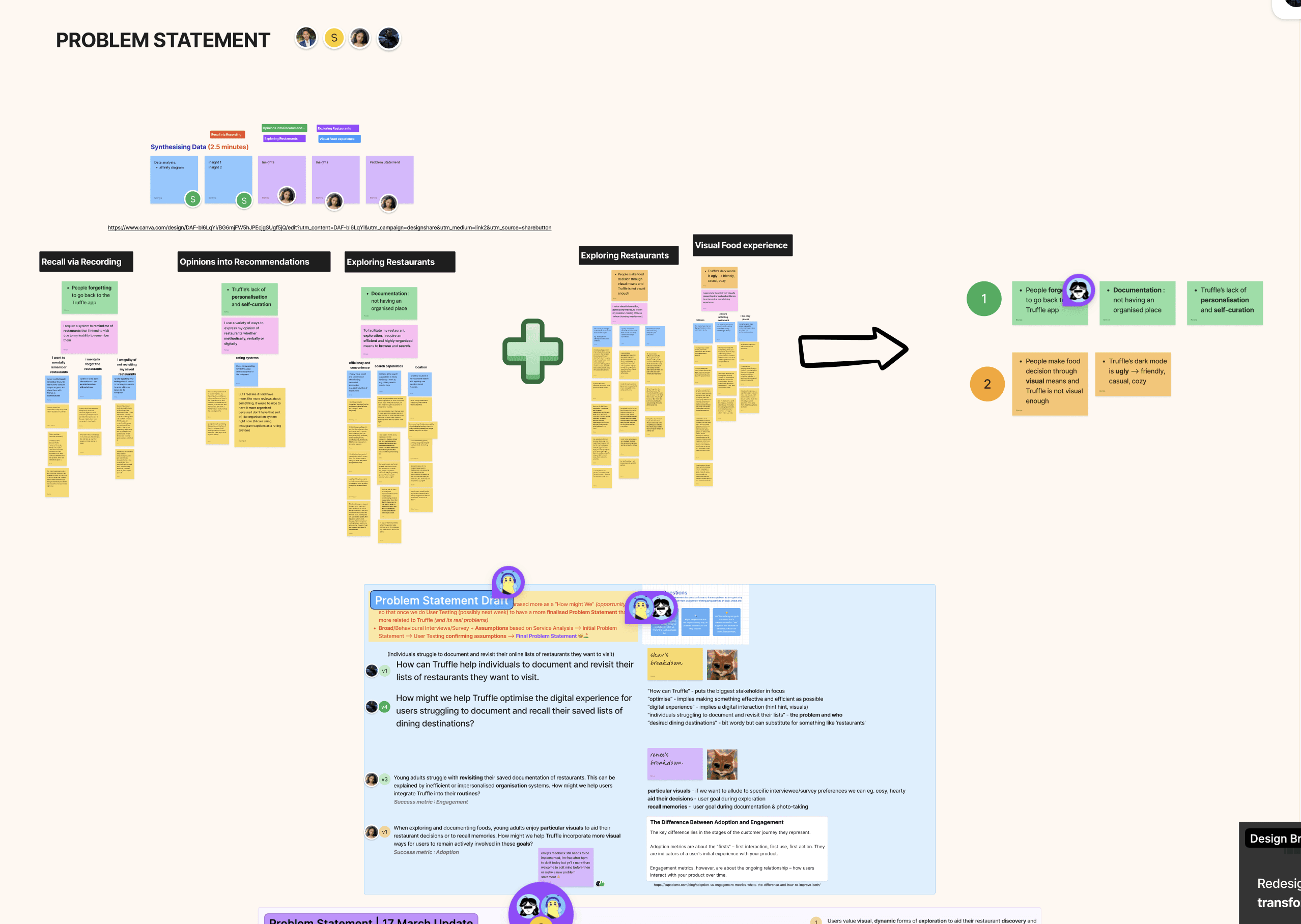
This slipped through us in a way that felt small at the time but compounded quickly. We were split on which insights mattered most, pulling the problem in different directions, and without strong product ownership in that moment, the decision never properly converged. The result was a problem statement that didn’t fully reflect the depth of what we had uncovered. We paid the price for that and were scored accordingly. Below is the version we refined after feedback.
PROBLEM STATEMENT
DESIGN
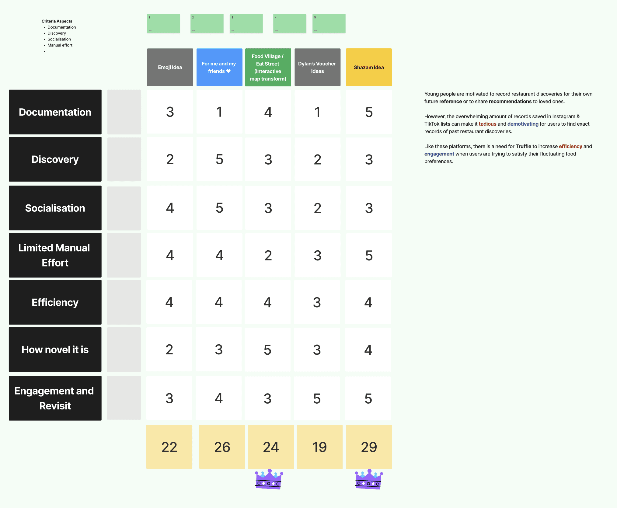
We used Crazy 8s and SCAMPER to rapidly generate concepts grounded in our insights, focusing on visual-first browsing, dietary-trust filters, time and location-based recall, and opinion-sharing. To narrow down, we ran a decision matrix similar to MoSCoW to prioritise the directions that best aligned with the problem.
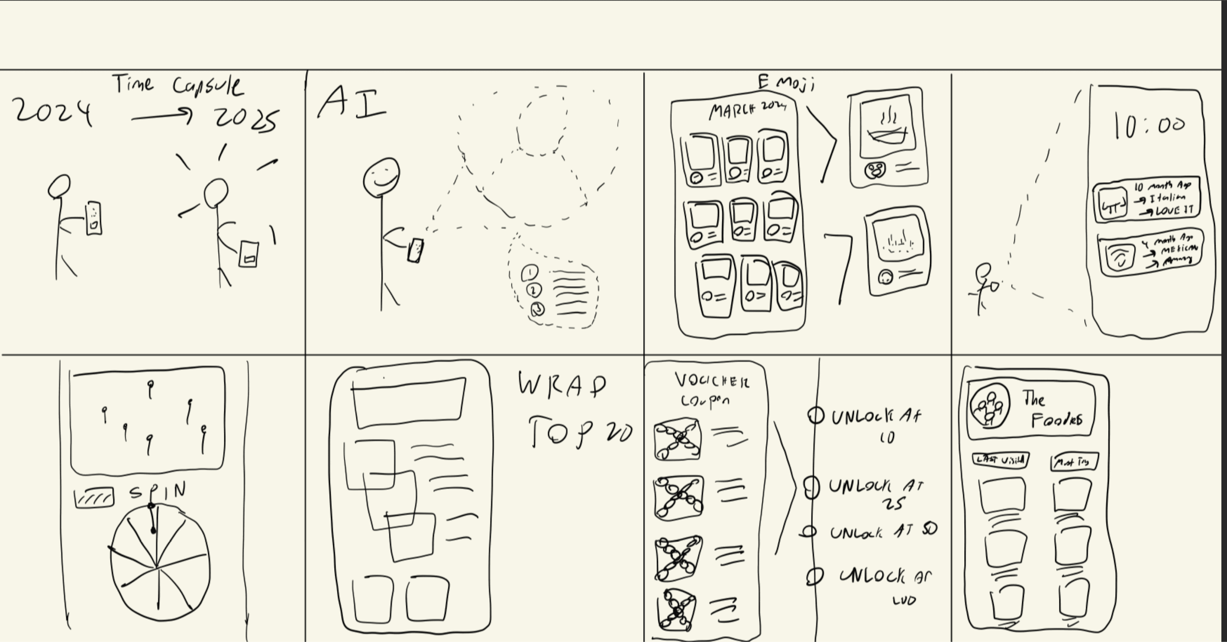
I was particularly interested in how Apple extends experiences beyond the app through things like widgets, App Clips, and Dynamic Island. I wanted to push Truffle in that direction and create something that lives outside the core app, giving users value in the moment. Out of this was done the ‘Shazam Idea’
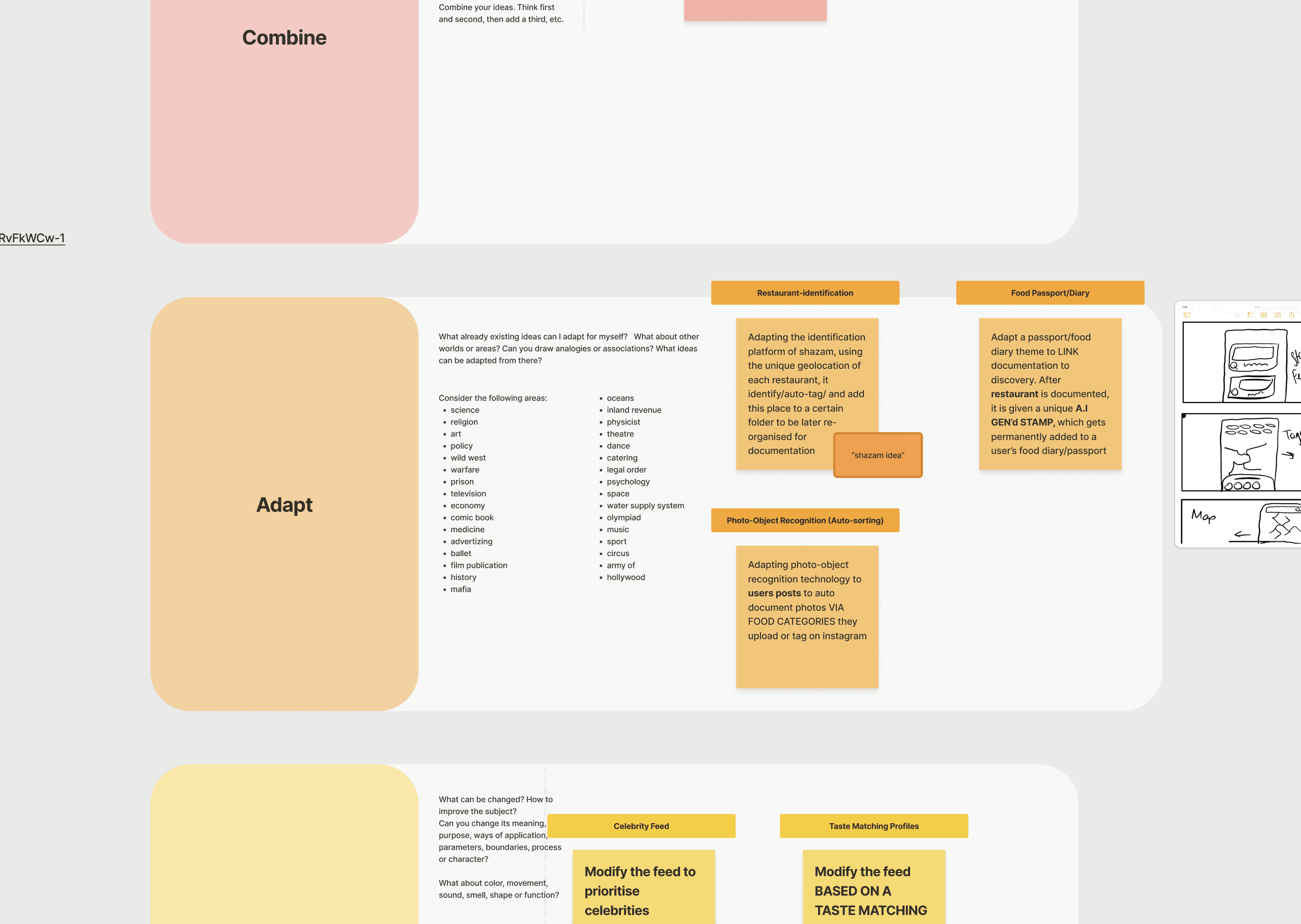
Adapting the music identification platform of Shazam, using the unique geo-location of each restaurant, this feature could auto-tag and add this place to a certain list to be later re-organised for documentation
Very cool idea, but we had to come to vote against all other ideas
Honestly, the ranking system didn’t feel entirely fair, but at that point I prioritised momentum over perfection. We were already halfway through, and continued indecision was slowing us down. I pushed for a call to be made so we could move forward, even if it meant working with an idea I didn’t like.
THE REAL CONCEPT DESIGN
From ideation, two feature directions emerged that directly responded to our key insights around recall, visual discovery, and social sharing. We focused on concepts that could be tested not just for usability, but for how they fit into real behaviours around saving, exploring, and recommending.
We developed two feature prototypes to bring these ideas to life and validate them in context, each targeting a different part of the journey from discovery to recall.

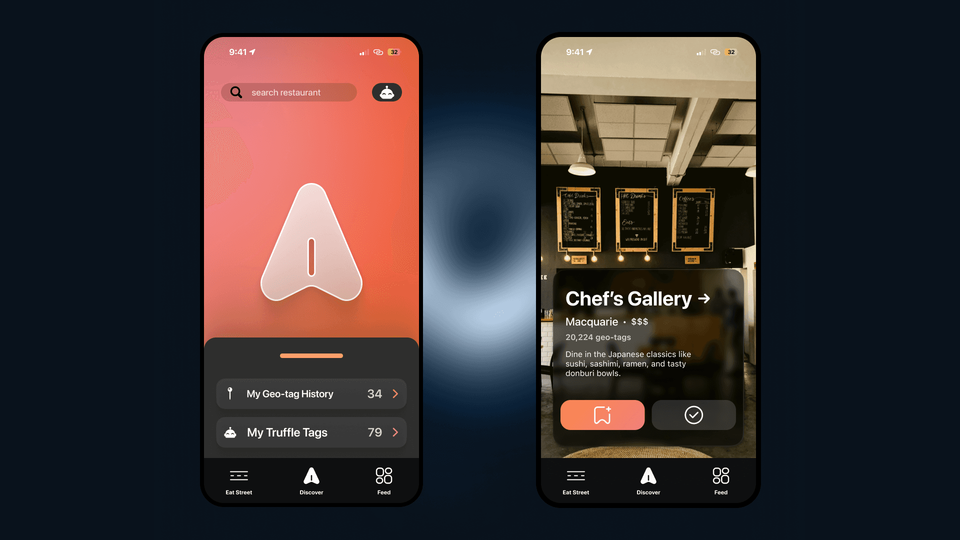
Eat Street focused on exploration and sharing
Dine Drop was built around the idea that users already record everywhere but struggle to return. Using geolocation, it allows users to quickly capture and save restaurants in the moment, turning passive recording into something structured and retrievable.
Dine Drop capture
A single tap uses geolocation to identify the restaurant and save it instantly. This removes the need to manually document or rely on memory.
Eat Street browsing
A folder-based interface that lets users organise, browse, and revisit restaurants visually. Users can sort into “To-dine” and “Dined” states.
Sharing + resurfacing
Users can explore friends’ Eat Streets and share their own, turning saved restaurants into recommendations. This supports users sharing opinions and relying on close circles for recommendations
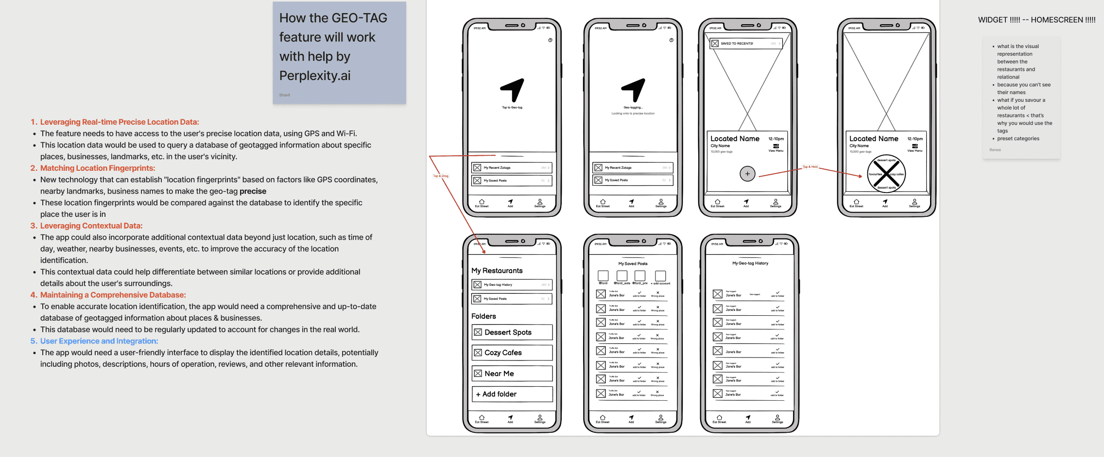
Conceptualising dine-drop
This is a low fidelity flow of the dine drop feature being accessed via the operating system’s control centre

We tested our prototypes through 5 think aloud sessions, guiding users through key flows like capturing a restaurant with Dine Drop, organising it into folders, and revisiting it later. This allowed us to observe how users navigated the experience in real time, where they hesitated, and what broke down.
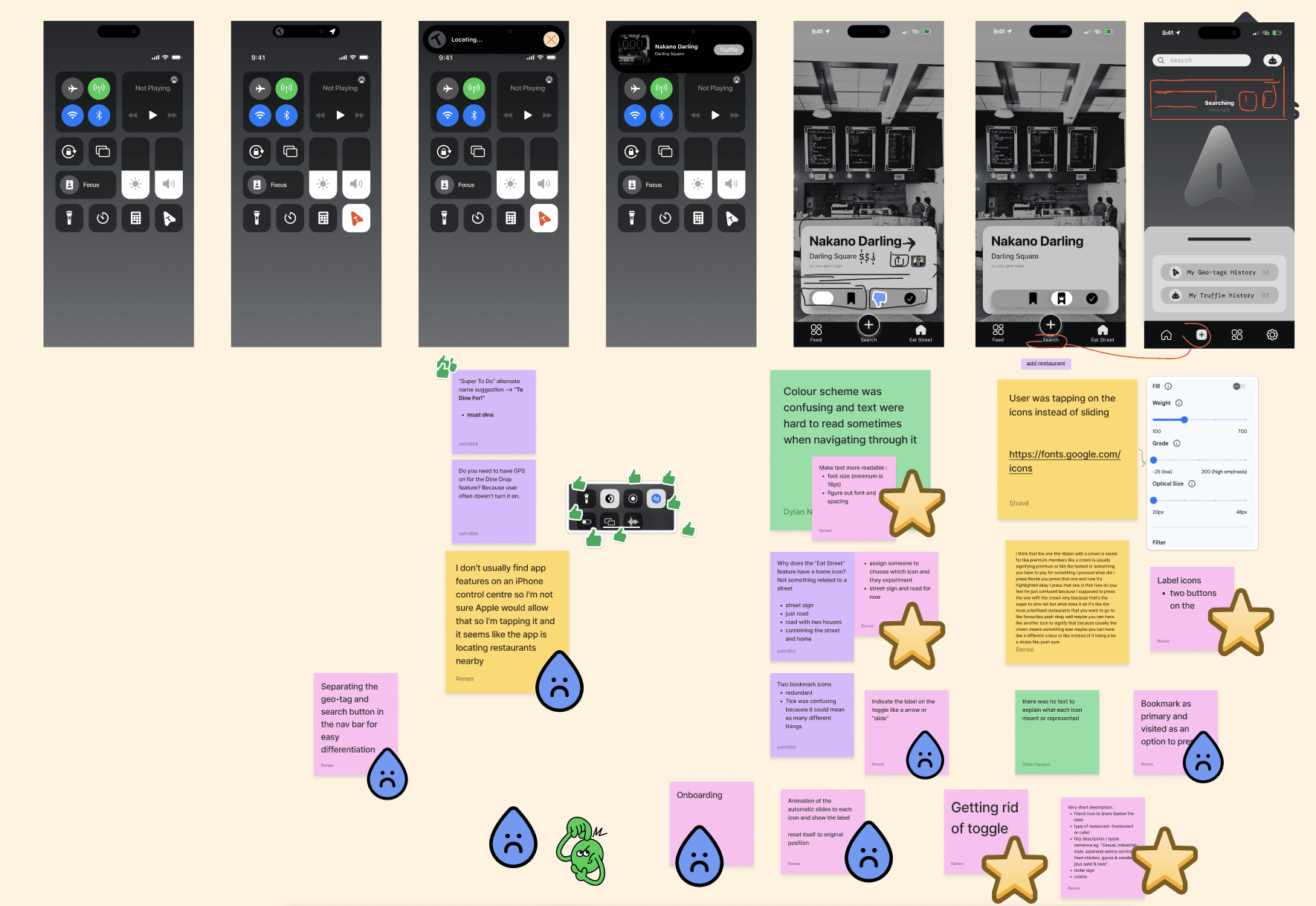
USABILITY TESTING LO-FI
1.
2.
3.
4.
OUTCOME
SOLUTION
Final Designs
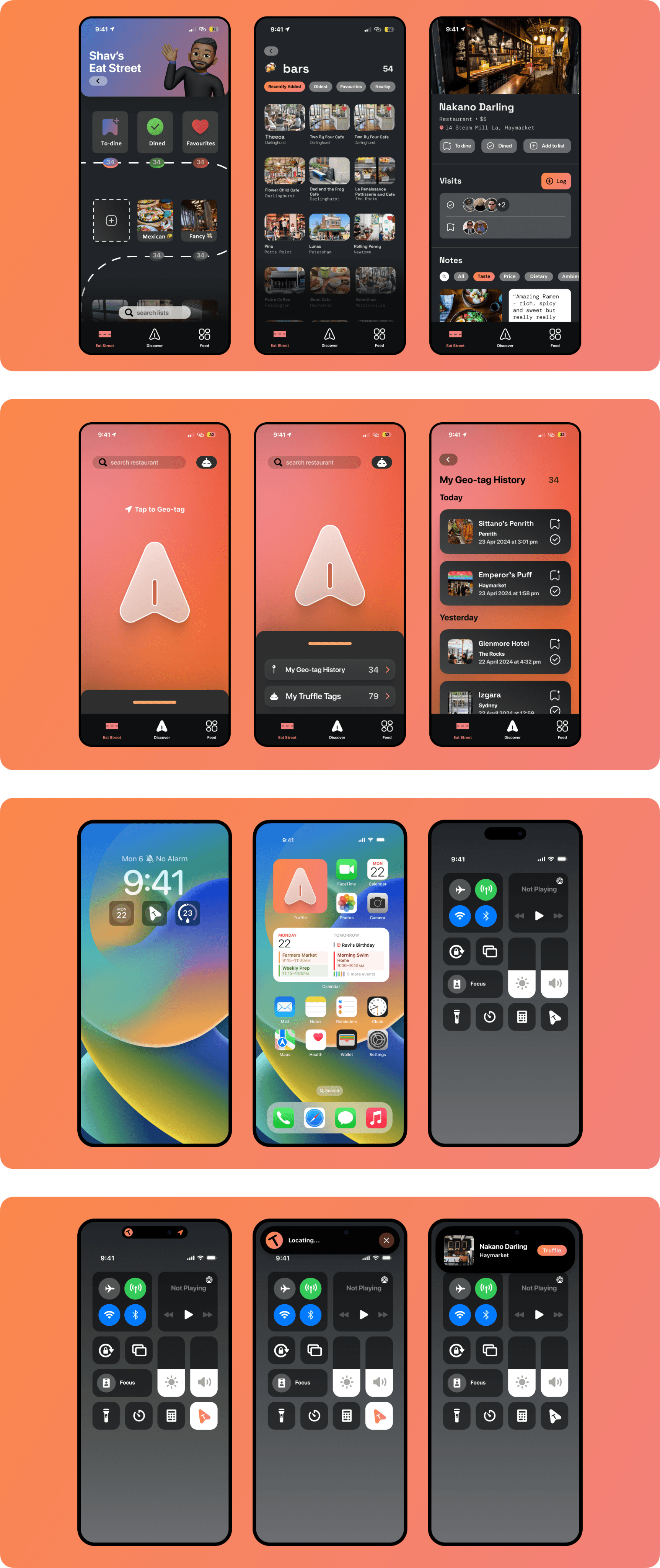
Dine Drop was designed as a quick capture system that also is accessible outside the app, using geo-location to identify nearby restaurants and let users save in the moment without breaking their flow. Instead of relying on memory or screenshots, it turns “I’ll come back to this” into something immediate and reliable, making capture feel natural rather than effortful.
Eat Street brings structure to everything that comes after. It reframes saved restaurants into organised, personal collections where users can browse, prioritise, and share through folders and friend networks. What was previously scattered across notes, screenshots, and social media is now a single, returnable thread that users can actually act on.
Users can quickly narrow by vibe, location, and dietary needs without overthinking filters or navigation
Eat Street organises saved places into clear, personal collections that are easy to revisit and share
Dine Drop enables fast, geo-based saving so users don’t rely on memory or scattered screenshots
Together, these features directly respond to what we saw in testing. Users record everywhere, but recall fails under volume and timing. By making capture seamless and recall structured.
RETROSPECTIVE
Some key takeaways
Team Collaboration: Working closely with a multidisciplinary team showed me how much smoother the process becomes when everyone is aligned early. We built a steady rhythm of communication, shared thinking, and small iterative decisions that helped the work feel cohesive rather than fragmented. It reminded me how valuable it is when a team genuinely collaborates instead of working in silos.
Personal Growth: I also grew a lot in my own craft. I became much more comfortable experimenting in Figma especially with vector graphics, interaction flows, and building cleaner component structures. It helped me translate ideas more clearly and gave me confidence to take on more of the visual and interaction detail without overthinking it.
UX/UI Strategy: From a strategy perspective, this project reinforced how important it is to let research anchor the design direction. Understanding the real gaps between how people discover restaurants, how they document them, and why they forget them shaped every decision we made. It strengthened my ability to balance the broader UX intent with the smaller interface details that support it.